Logo and Identity Development
Sinclair Design started life in 1987 as a Strategic Design Consultancy specialising in corporate communications. Designing logos, identity systems and style guides for large organisations, including stationery, signage and vehicle livery etc. was the consultancy's primary activity.
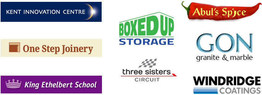
Although these days we are more of an 'internet-tech' business, the skills and specialisms of our past are still very much part of our DNA. So, whether you represent a huge company or a small firm, when it comes to your logo and its suitability for your current trading environment, if you'd like our help, we really do know what we're talking about. Shown below are just a random handful of the hundreds of logos we've created over the years, each very specifically designed to suit a particular organisation's marketing strategy in a specific market.
What is an organisation's identity?
The term ‘corporate identity’ refers to much more than the design of an organisation's stationery or website — it is a blanket-term that refers to the particular way that an organisation presents itself and interacts with its staff and public. A company’s identity is the sum total of its history, beliefs, environment and visual appearance (stationery, website, uniforms, signage, brochures etc.) and is shaped by the nature of its technology, its ownership, its people, and its ethical and cultural values.
Why does an identity matter?
The recipient of a letter or brochure from a previously unknown organisation will instantly (if only subconsciously) judge that organisation’s professionalism and market-standing on the look and feel of the item in their hands. This is just a fact of life. The same is also true for the internet where websites are very often used to gain that all-important first impression of an organisation.
How can an identity be developed?
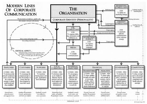
When an identity development project is undertaken by Sinclair Design, research is usually carried out to accurately identify and profile the organisation’s different audiences (e.g. customers, suppliers, employees etc.) and the most effective marketing ‘message’ to send out to each of these groups is defined. The diagram here shows a summary of these lines of communication as they related to a large NHS Trust that we worked for some years ago.
Symbols, styling and layouts are then skilfully designed to convey the right impressions to the right people (in each case) and the resulting collection of designs and guidelines (sometimes defined in a 'style guide') becomes the visual part of the company’s identity, often incorrectly referred to as the 'brand'. When used properly, this visual identity system can be an organisation’s biggest asset.

For example: when somebody buys a car bearing the Ferrari or Mercedes symbol, they know they are getting the very best in automotive engineering - not necessarily because they understand how the cars are built, but because the identities of these companies, and hence their brands (how they are perceived), have been carefully controlled and nurtured over many years to represent all that is good about motoring excellence. The fact that their respective brands successfully reflect high standards of workmanship and modern, aspirational lifestyles is certainly no accident.
How important is a logo?
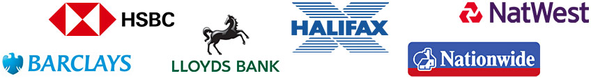
The products and services offered by different companies in similar markets tend to be so alike nowadays that differentiation is an ongoing problem. In fact the packaging and promotion of goods and services in a distinct and attractive way is often one of the only practical methods for a company to differentiate itself and its products with a view to gaining a competitive edge. Banks are a prime example of this, all offering very similar services and rates, but each in its own way, each with a distinctive logo at the heart of its promotional efforts.
But there’s far more to logos and trademarks than differentiation alone: study after study shows that the world’s most successful companies (both large and small) are each guided by a clear sense of shared values and identity. Each has purpose and direction. In other words, everyone knows what the organisation stands for, where it’s going, and how it intends to get there.
Successful companies communicate carefully targeted visual messages about their organisations, clearly and consistently, year after year. These messages may sometimes begin as being somewhat unrepresentative, but provided they are properly reinforced and driven home at every opportunity, both inwardly and outwardly throughout the organisation, the company or organisation will usually become what it aspires to be.
BMW is known for technical innovation and vigour. Marks & Spencer is known for affordable quality. The Body Shop is known for environmental friendliness. These reputations did not happen by chance - each is the result of years of careful planning and a well defined presentation and behavioural strategy.
As explained above, the many different aspects of the way in which an organisation presents itself and interacts with its staff and the outside world make up its ‘identity’ (thus the term ‘corporate identity’ goes far deeper than stationery alone). If this identity is well managed, consistent and based on a defined set of values or a clear marketing strategy, then everything gels together and everyone coming into contact with the company (including its employees) sees a unified picture of purpose, direction and belief in a mission. However, if mixed messages emerge through, for example, uncoordinated visual output, then the identity is weakened and people become confused about what the organisation stands for and what it offers that is different to others in its field.
Of all the different aspects of an organisation’s identity, one thing stands out as being common to nearly all physical expressions of the corporate personality: the company's trading or identifying mark, usually referred to as its logo (although strictly speaking, the word 'logo' refers to a company's initials set as a single unit in a unique way). This is, or should be, the common thread running through everything from the smallest business card to the largest vehicle livery. It should be clear, strong, instantly recognisable at any size and capable of communicating the required qualities or message. From this one graphic device stems all other visual expressions of what the company stands for and where it sees itself positioned within its market.
Visit McDonalds, for example, and you will see the same strong, red and yellow ‘archway’ imagery running through just about everything you see. When first used this symbol would only have conveyed qualities such as friendliness and fun (in the subtle and subconscious way that such symbols do), but as the firm’s reputation (or ‘brand’) has grown in size and strength over the years, so the symbology has taken on all the qualities associated with the growing company.
So, what starts out as a pretty symbol on a letterhead soon becomes, through association, an embodiment of all that the organisation is. It also serves to differentiate, which is where we came in. It is no coincidence that every successful organisation has behind it a strong and consistent identity system, which is doubtless what helped it to become successful in the first place!