Design and Corporate Communication Terminology

The language of the corporate communications specialist is a complex one, more often misused than properly understood. With twenty-seven years experience in the field, the following definitions are offered in an attempt to clarify some common terms without over-simplification:
LOGOTYPE or WORD MARK
Taken from the Greek word Logos (meaning ‘word’), logotypes were originally single pieces of hot-metal type that printed a word as one unit. If company names were required to appear many times on different stationery, printers would often cast single logotypes (often embellishing the lettering at the same time) to ensure consistency of the company name throughout a range of printed items. The word ‘logotype’ is still used to refer to a company’s name set in a specific and unique way, for example Google, Sony and Coca-Cola all use logotypes in the traditional manner.
CORPORATE SYMBOL
Symbols are often used as emblems by organisations, usually fitting into one of three categories: (1) Abstract - patterns or shapes that do not clearly refer to the organisation but that can usually be deciphered eventually. Such symbols will only illicit association after the public has been exposed to them for some time and are synonymous with very large, often impersonal, organisations. Examples: NatWest Bank, Touche Ross. (2) Descriptive - a recognisable picture directly associated with the company’s service or product. This is the best form of direct communication as the organisation’s purpose or market is usually instantly relayed to the viewer. Examples: British Gas (a gas flame), Burger King (a burger), WWF (an endangered species). (3) Associational - a well-known symbol or recognisable object is used to imply the possession of certain associated qualities, or to show location by utilising well-known landmarks. Examples: Jaguar, Lloyds Bank, Texas Instruments.
CORPORATE SIGNATURE
When a company adopts the use of both a logotype and a symbol, these are often used together as a single unit called a ‘signature’. Various arrangements of this may be designed for different applications, sizes or formats e.g. portrait or landscape spaces. Strictly speaking, a logotype or symbol on its own can be a signature if that is how it is normally used, but the term usually refers to a collection of elements in a specified visual relationship.
LOGO
The word 'logo' differs in meaning according to who you speak to. At Sinclair Design we used to maintain that a logo was a logotype made up of initials (e.g. the IBM trademark); others will define it as a symbol used for identification (e.g. the Renault diamond); whilst many refer to it as the combination of a logotype and symbol (which is actually a 'signature'). These days it is probably safe to say that most people think of any trademark as a logo, be that a logotype, symbol or any combination of the two, so long as it is visually unique and used consistently. It is, when all is said and done, a means of identification that can also be used to subconsciously communicate particular emotions or qualities. But only after a logo becomes familiar and associated in people's minds with a particular level of quality or service, does it become properly effective.
CORPORATE IDENTITY
Contrary to popular belief, the term ‘corporate identity’ refers to much more than just the design of one’s stationery — it is a blanket-term that refers to the particular way that an organisation presents itself and interacts with its staff and public. An organisation’s identity is the sum total of its history, beliefs, environment and visual appearance (stationery, architecture, uniforms, signage, brochures etc.) and is shaped by the nature of its technology, its ownership, its people, its ethical and cultural values and its strategies. The principle can be better understood with the help of an analogy... The way that you walk; the clothes you wear; the style of your hair; the car you drive; the words you use and the manner in which you meet and deal with people are all expressions of your personality. Collectively, they are your identity. Now; apply this principle to an organisation and all should become clear.
CORPORATE IMAGE or BRAND
Corporate Image is another blanket-term, used to describe how an organisation’s staff and public actually perceive it to be. An organisation’s image or brand is the impression that its various audiences have of it, formed through their direct contact with the organisation and as a result of all the conscious and subconscious messages they receive, both intentional and unintentional, good and bad. A brand is very much in the eye of the individual beholder, but by treating the business’s different audiences as distinct groups (e.g. customers, suppliers, employees, shareholders, analysts etc.) and then monitoring the opinions of selected individuals within each group, trends and commonly held views can usually be found and analysed. Continuing with the analogy used above... Your work colleagues each have a certain impression of you, based on what they see and hear, and on your dealings with them on a day-to-day basis. If you were to collect the opinions of all who know you, some similar impressions would doubtless emerge and this collective perception of your personality is your image or brand. That brand cannot be designed or 'made' per se, but it can be shaped and influenced by skilful management of the identity system in all its facets, a process known as corporate communications.
CORPORATE COMMUNICATIONS

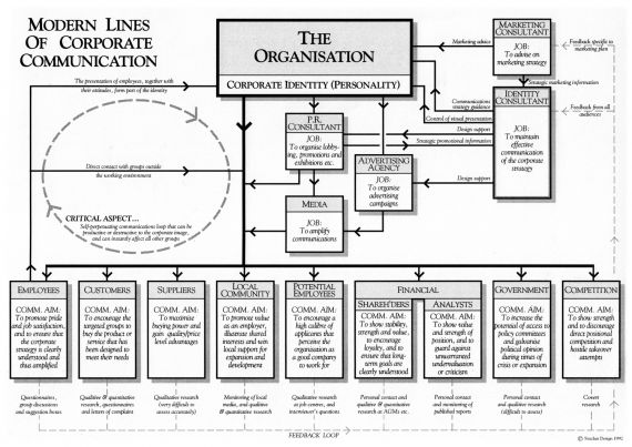
The whole process of ensuring that people see an organisation in a way that is optimally beneficial to its long-term strategies is extremely complex, involving rationalisation of the corporate strategy, identity development, and image or brand management. This discipline of controlled interaction between an organisation and its environment is known as ‘corporate communications’ and is, for any organisation trying to survive in a competitive market, worthy of as much executive attention as financial management or stock control. It is a discipline best handled by independent specialists who are able to maintain an outside perspective, ensuring that they see the organisation as it actually is, as opposed to how those within it think it is seen. The flow-chart above was designed by Sinclair Design to illustrate the principle means and aims of communications that should be managed as part of a corporate communications strategy.
